Weronika Rafa is an award-winning designer and creative director with over a decade of industry experience. She develops brands and design systems across multiple platforms, from print, through digital, to motion. In her career she has worked with clients big and small from all parts of the globe. This includes some of the world's most reputable companies such as Google, Apple, Facebook and Adobe.
Weronika's aesthetic draws on her background in graphic design, typography and art, elevated by bold storytelling. In design she's most excited about what’s weird and unusual within the sector and the wider world. This curiosity is currently pushing her towards typographic (ugly-ish) posters and creative coding inside the design process.
With over 60K social media followers she constantly looks for new expressions and has recently welcomed the role of an industry speaker.
For new projects and partnerships please email: hello@grafa.uk.


The imperfect guide to interpersonal attraction
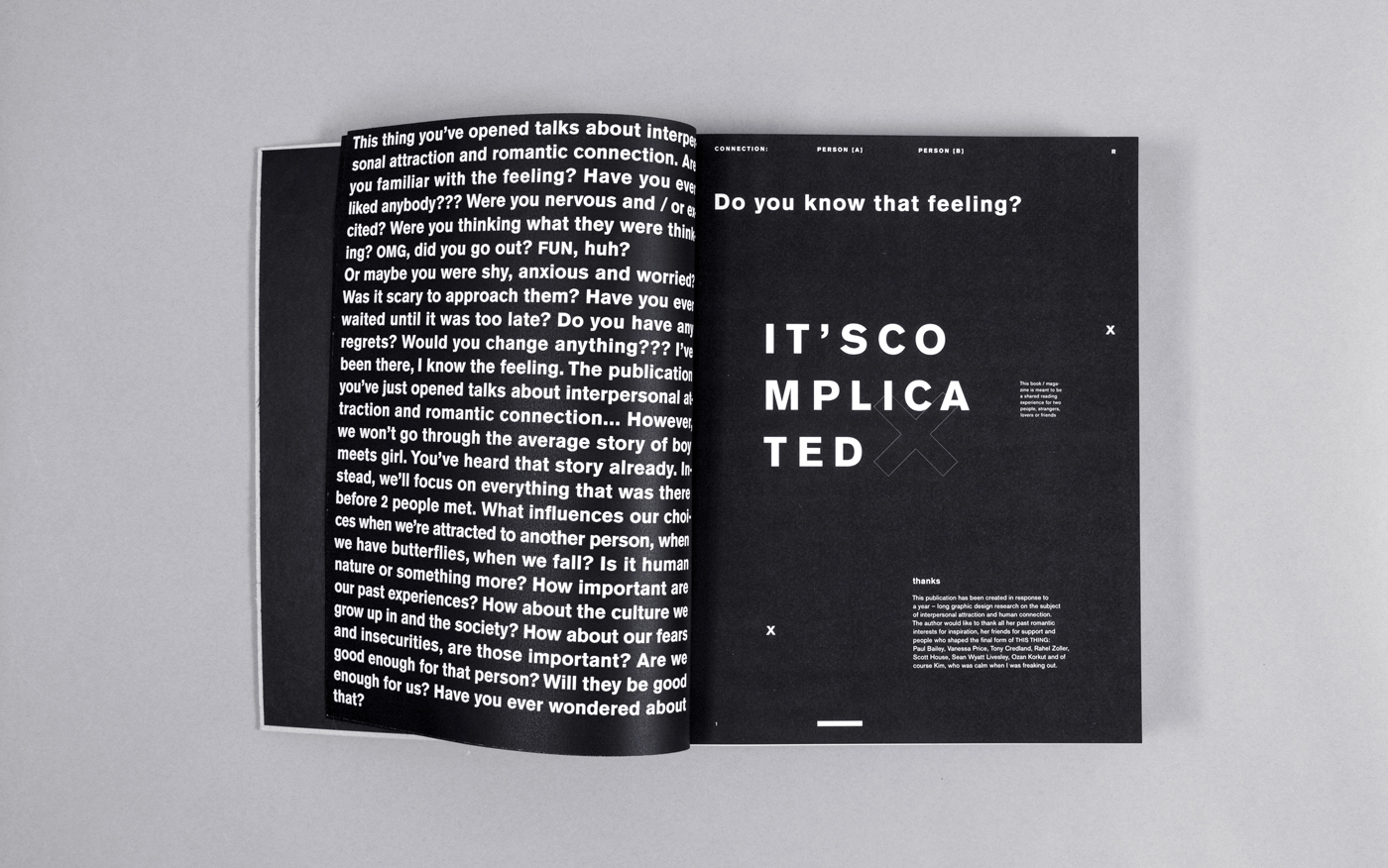
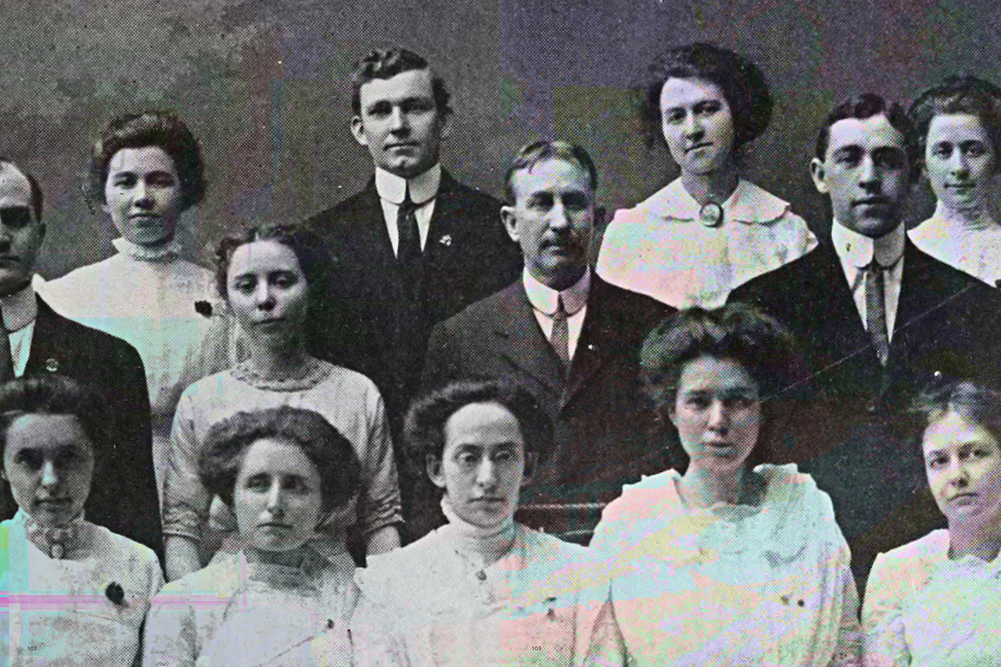
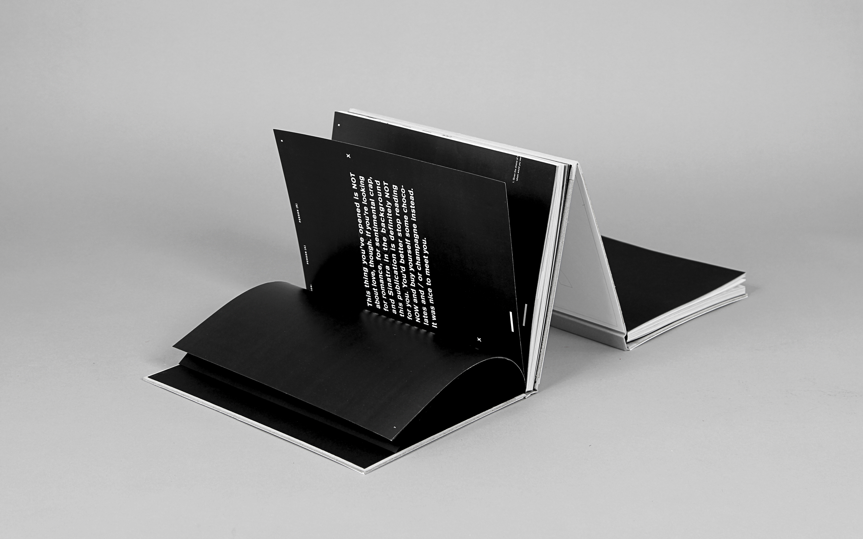
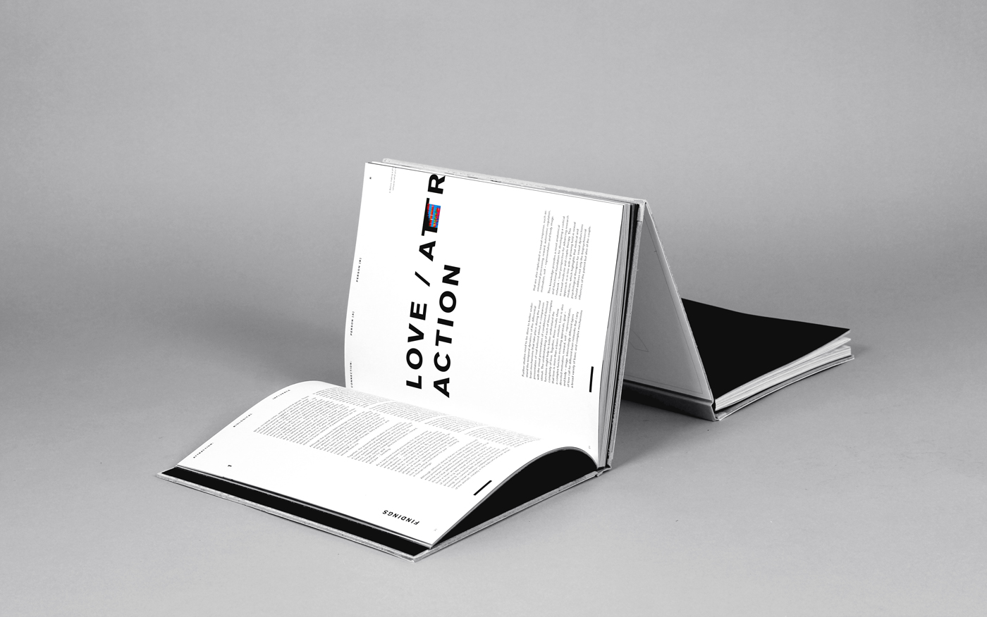
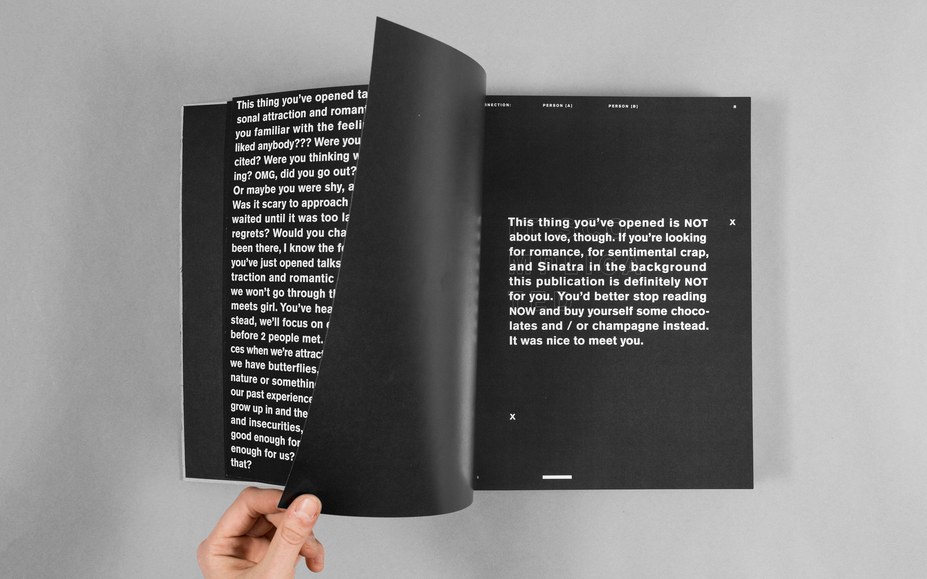
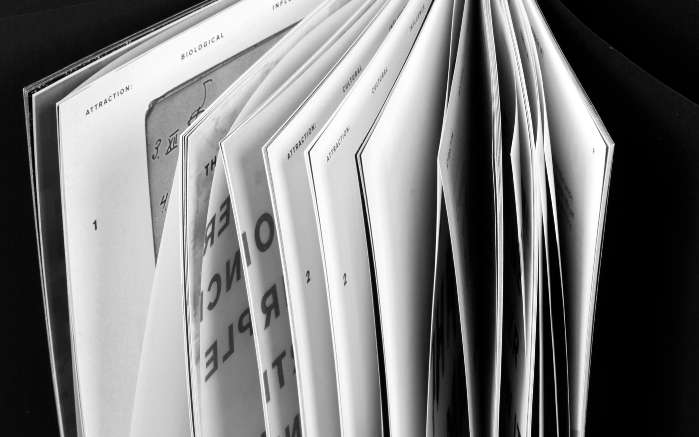
This book is a response to overpresent and overemotional issue of interpersonal attraction. While drawing its chapters from evolutionary psychology, western culture and neuroscience the narrative takes the reader through a layered question of what it means to be attracted to someone?
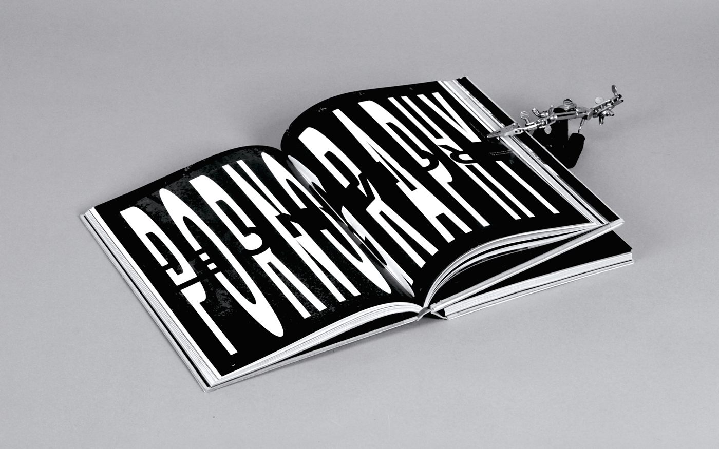
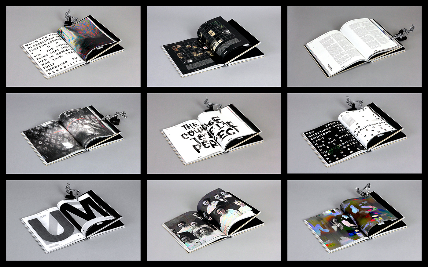
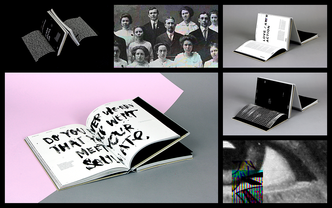
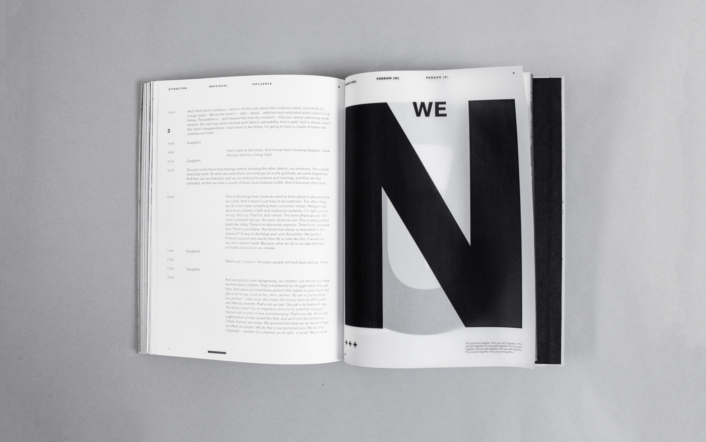
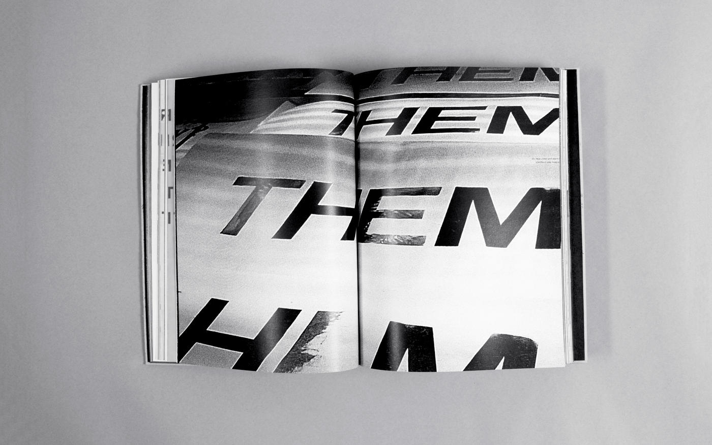
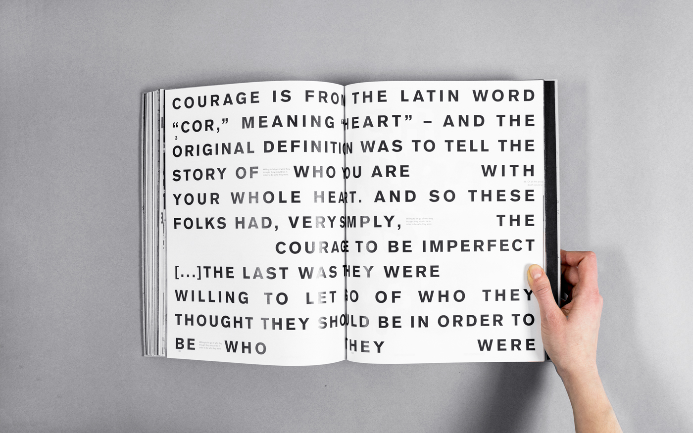
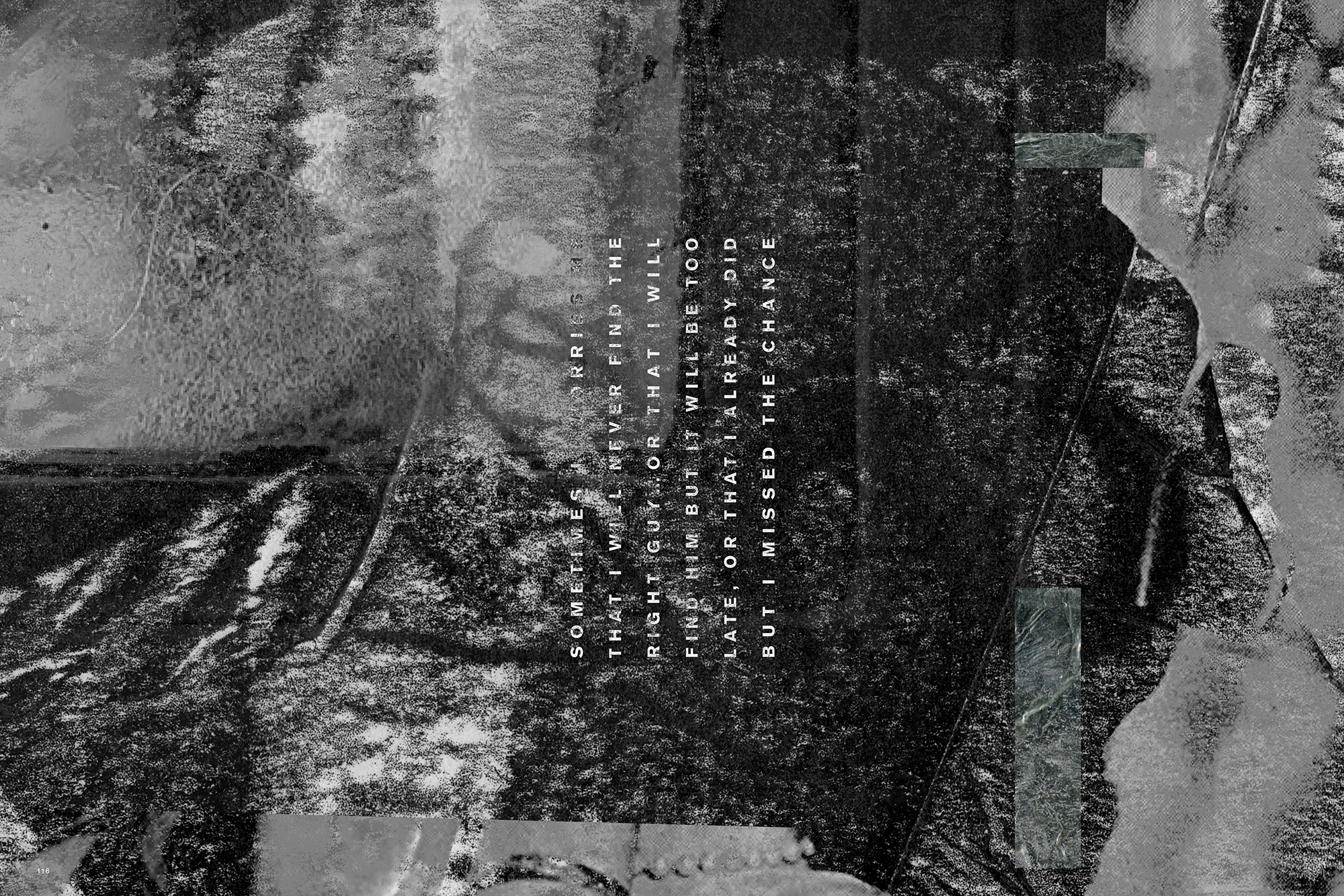
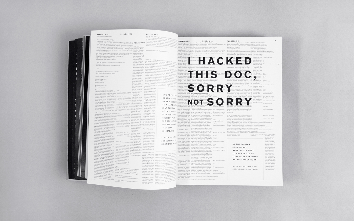
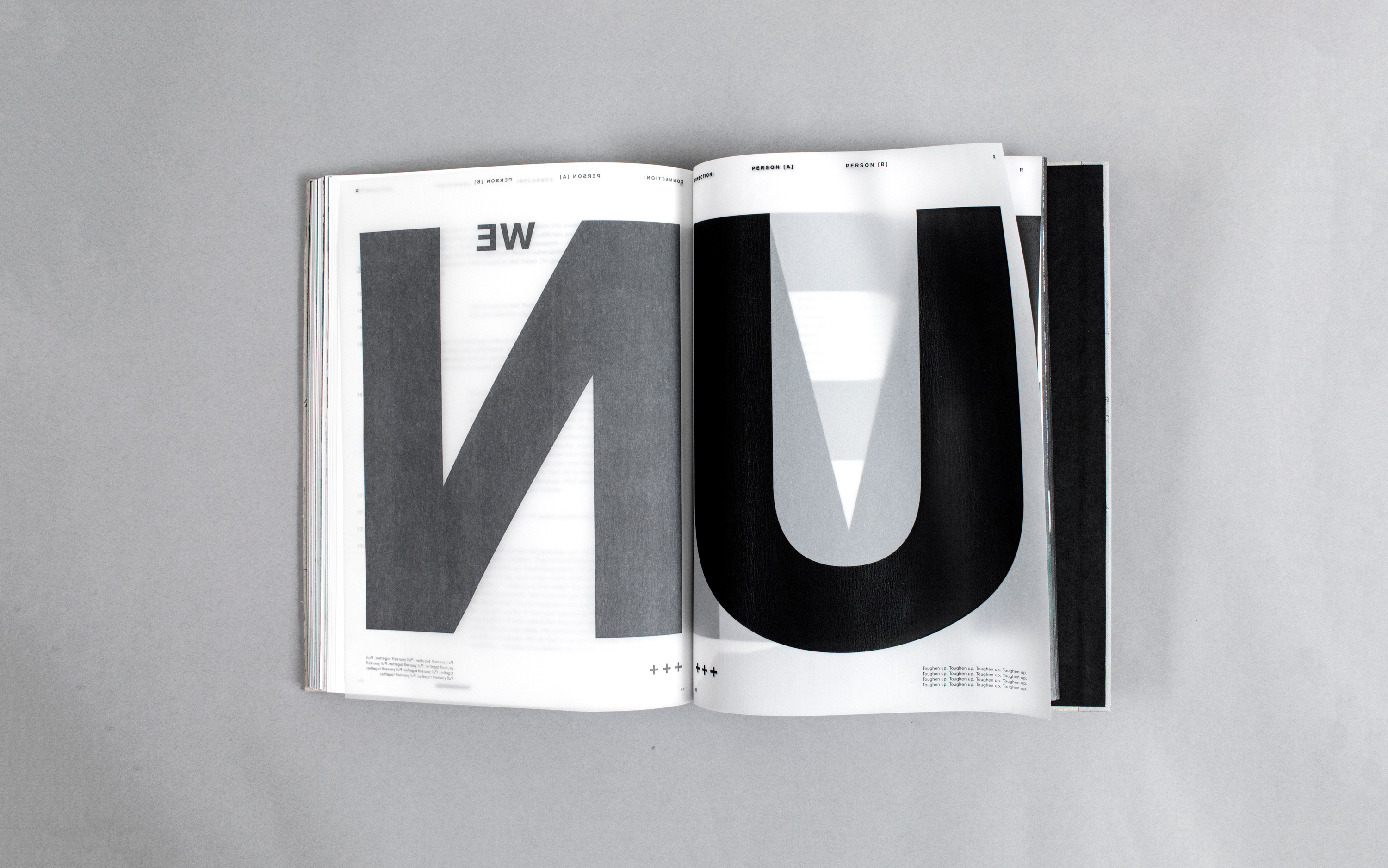
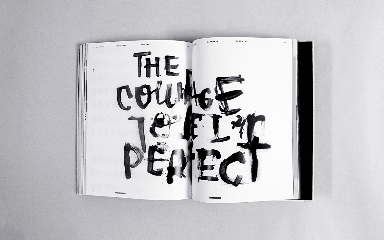
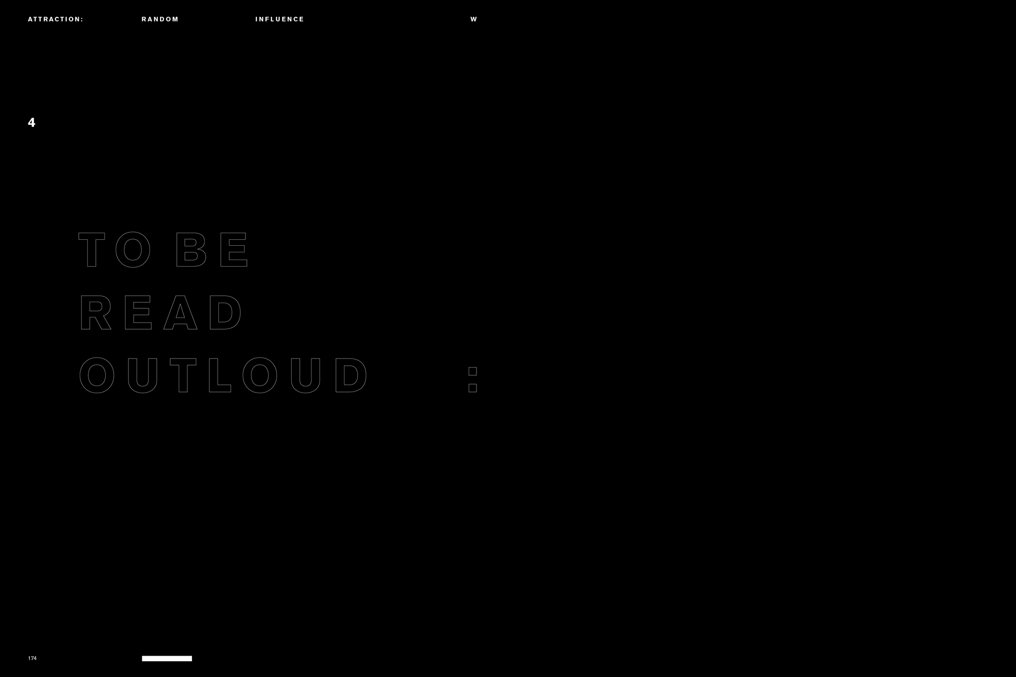
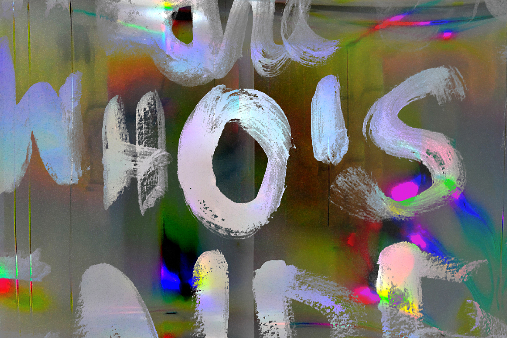
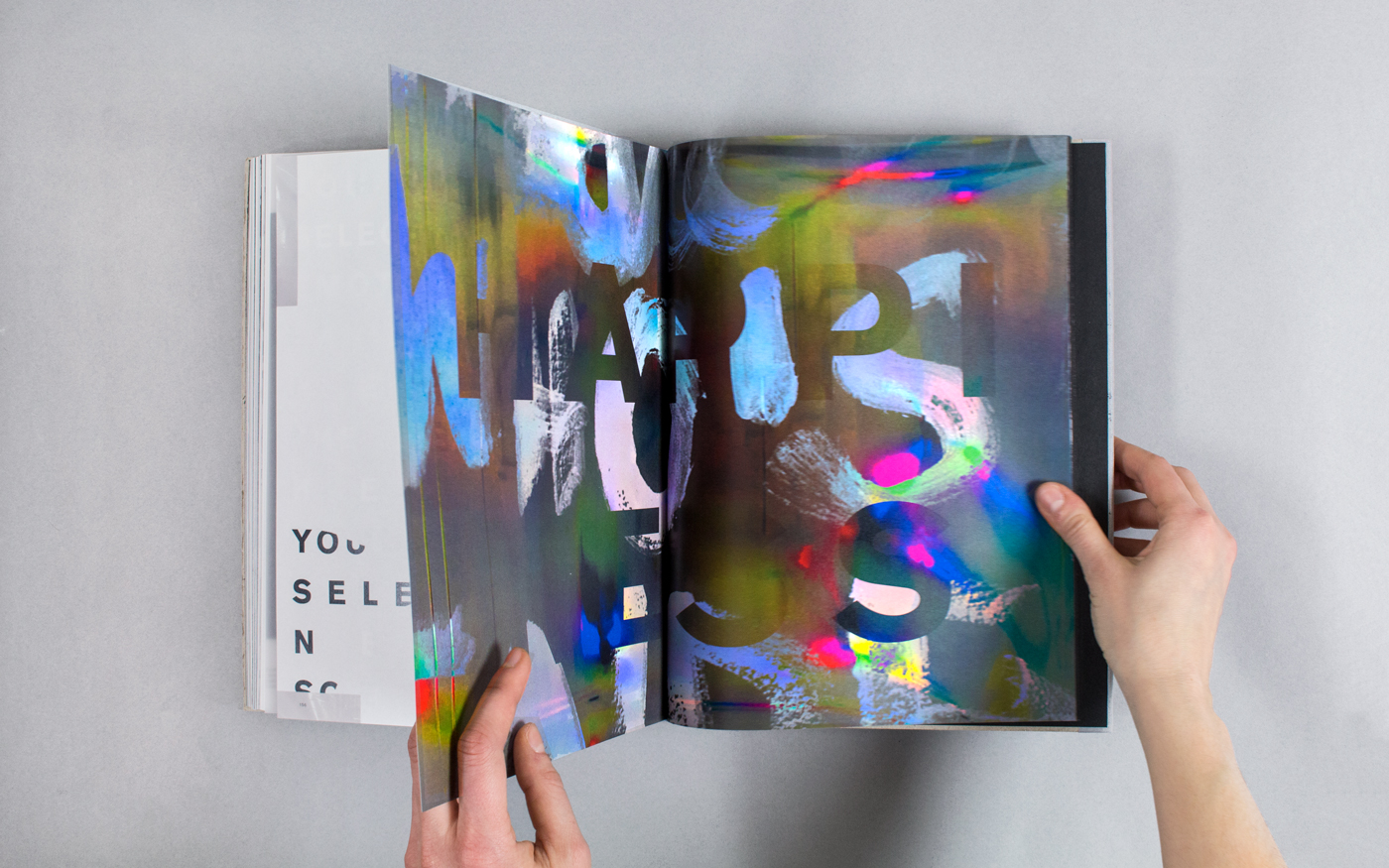
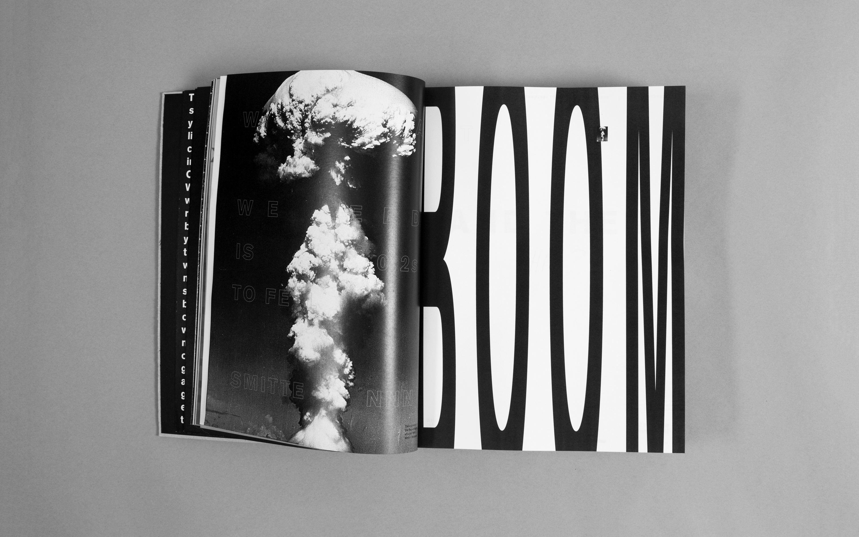
Design of the volume combines typographic expression with methodical planning, juxtaposing between the two. Ink, distortion and glitches are used to sabotage the book's legibility and symbolise the idiosyncratic nature of the subject.
The flow of information constantly alternates between diverse points of view, making the book question itself.
With thanks to Vanessa Price, Paul Bailey and Tony Credland.
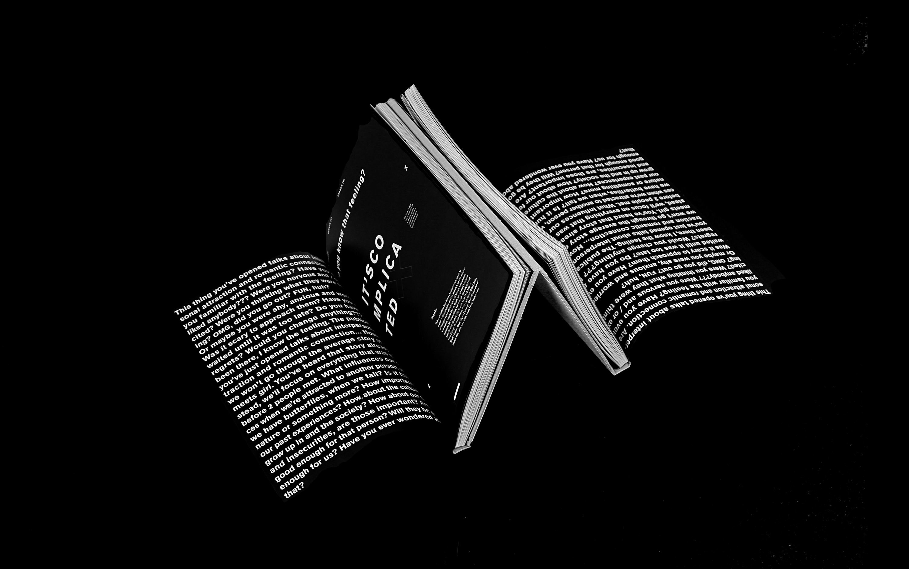
The imperfect guide to interpersonal attraction
This book is a response to overpresent and overemotional issue of interpersonal attraction. While drawing its chapters from evolutionary psychology, western culture and neuroscience the narrative takes the reader through a layered question of what it means to be attracted to someone?
Design of the volume combines typographic expression with methodical planning, juxtaposing between the two. Ink, distortion and glitches are used to sabotage the book's legibility and symbolise the idiosyncratic nature of the subject.
The flow of information constantly alternates between diverse points of view, making the book question itself.